
Simplicity is key when designing the right logo for your business. A good logo can help a buyer identify a brand in a split second, which is exactly what you want when your product is swimming in a sea of competitors.
![]()
Delivery Cooperative was founded to fill a niche market: making home delivery services available from all restaurants to all residents in a local territory. Uber had the same idea: Uber Eats.
The goal for this logo was to convey the idea of catering, cleanliness and professionalism. The logo combines the appearance of a five-star maître d’ with a covered glass dish, giving the sense of a top-notch delivery experience.
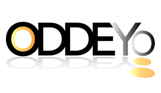
Designed for a fictitious audio technology manufacturer, Oddeyo was an exploration in color, typography and crisp design.
Specifically taking into account its performance on retail packaging, we went through several iterations before settling on the design above. Here are some of the earlier concepts:


The Klenesy design needed to stay simple — looking clean on any surface, including leather tags and denim. It’s simple, timeless, and easily recognizable. The design can be changed to any color and printed on promotional materials, letterhead and business cards with no reduction in quality or readability.
![]()
Frolic was a challenge. As a brand new, high-end specialty pet boutique in the beautiful Sonoma County wine country, the logo needed to be memorable without being cheesy or predictable. The logo and store name were being created together, one dependent on the other. This resulted in many iterations and revisions.
The main requirement of the logo, regardless of store name, was the inclusion of a muddy paw print. This made for an interesting logo, but a potential challenge for the sign shop. In this case, we opted not to order a die-cut sign, which allowed us to keep signage costs down.
The black and white version worked surprisingly well on a rubber stamp we ordered, with minimal loss to the mud. This design would look great on T-shirts, hats, and mugs.
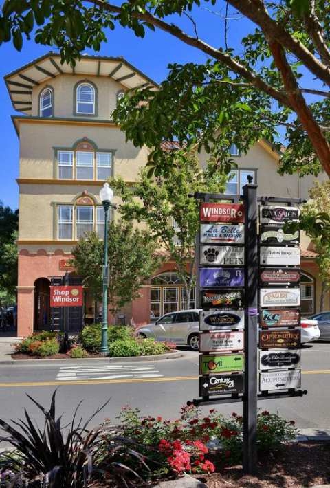
![]() The colors we used for the signage were meant to look like the custom cookies sold in the store, while staying in line with the Victorian-style buildings on the Town Green.
The colors we used for the signage were meant to look like the custom cookies sold in the store, while staying in line with the Victorian-style buildings on the Town Green.
Our color scheme stayed in line with the Town Green’s overall look and feel and the design attracted a lot of attention to the store. It also meshed well with the Town Green’s street directory. Our sign is on the left, third from the top.
Contact me to discuss your project.
![]()
